Matching kitchen cabinets means picking colors, finishes, and styles that look good together and with other things in your kitchen. It’s about making choices that create a look you love, whether it’s modern, cozy, or something else. It involves thinking about cabinets, countertops, floors, walls, and even small things like handles. Getting this right makes your kitchen a nicer place to be.
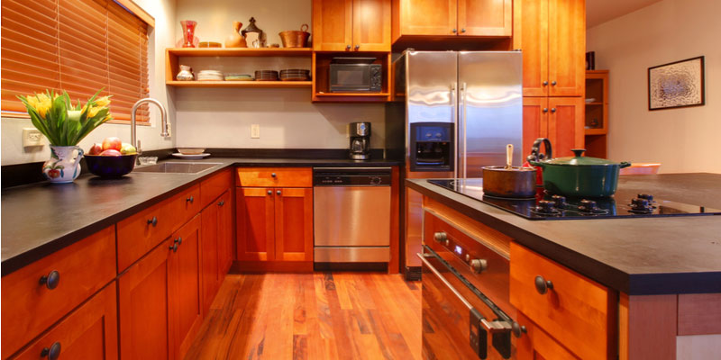
Image Source: topscabinet.net
Picking Your Kitchen’s Feel
Before you pick out cabinet colors or styles, think about the overall feel you want in your kitchen. Do you like a bright, airy space? Or do you want a warm, cozy room? The style you choose will guide all your other decisions.
What Look Do You Want?
Think about the style of your home and what makes you happy.
* Modern: Often uses clean lines, flat panels, and simple colors like white, gray, or black. Minimal decoration.
* Traditional: Likes details like raised panels, decorative trim, and richer wood tones or classic painted colors.
* Transitional: Mixes parts of modern and traditional styles. It’s clean but can have some softer touches.
* Farmhouse: Feels warm and relaxed. Often uses white or light-colored cabinets, natural wood, and simple shapes.
* Rustic: Brings in natural materials like wood or stone. Cabinets might have a more rough or distressed look.
Figuring out your style first helps with kitchen cabinet style coordination. Once you know the style, picking cabinet shapes, colors, and finishes becomes much easier.
Thinking About Space and Light
The size of your kitchen and how much natural light it gets are very important.
* Small kitchens: Light colors make a small space feel bigger and brighter. Think white, light gray, or pale wood colors.
* Big kitchens: Can handle darker colors or bolder looks without feeling small.
* Kitchens with little light: Need lighter cabinet colors and good lighting to feel cheerful.
* Kitchens with lots of light: Can use a wider range of colors, including darker ones, as the light will keep the space bright.
Consider how the cabinets will look at different times of the day. Colors can change depending on the light.
Key Choices: Cabinet Colors and Finishes
The color and finish of your cabinets are big decisions. They cover most of the kitchen’s walls, so they have a huge impact on the look and feel.
Choosing Kitchen Cabinet Colors
There are endless options for cabinet colors. Popular choices change over time, but some colors are timeless.
- White Cabinets: A classic choice. White makes a kitchen feel clean, bright, and open. It works with almost any style. White is very versatile for kitchen cabinet color pairings. You can pair white with almost any countertop, backsplash, or wall color.
- Gray Cabinets: Gray is like a modern neutral. It comes in many shades, from light silver to deep charcoal. Gray can look sleek and modern, or soft and cozy, depending on the shade and what you pair it with. It’s a great middle ground if white feels too bright or black feels too dark.
- Navy or Blue Cabinets: Blue cabinets have become very popular. Navy blue gives a kitchen a rich, deep look. Lighter blues can feel calming and airy. Blue works well in many styles, from traditional to modern. It pairs nicely with white, gray, and wood tones.
- Green Cabinets: Green is another color that’s growing in popularity. It connects the kitchen to nature. Soft sage greens or deep forest greens can create a unique and warm feel. Green cabinets pair well with wood, brass hardware, and simple white or cream elements.
- Black Cabinets: For a bold, dramatic look. Black cabinets can make a kitchen feel sleek and modern, or moody and elegant. They work best in larger kitchens or those with lots of light, so the space doesn’t feel too dark. Black pairs beautifully with white, wood, and metallic finishes.
- Wood Tone Cabinets: Wood offers warmth and natural beauty. The color of wood cabinets depends on the type of wood and the stain used.
- Light wood (like maple or birch) feels airy and modern or Scandinavian.
- Medium wood (like oak or cherry) offers classic warmth.
- Dark wood (like walnut or espresso-stained maple) feels rich and traditional or modern depending on the style.
When choosing kitchen cabinet colors, think about the mood you want. Light colors feel open and clean. Dark colors feel grounded and dramatic. Medium colors feel warm and balanced.
Kitchen cabinet color pairings
You don’t have to use just one cabinet color. Using two colors is a popular trend, often called a “two-tone kitchen.”
- Upper and Lower Cabinets: A common pairing is using one color for the upper cabinets and another for the lower cabinets or island.
- White upper cabinets with navy or gray lower cabinets is a popular look. The light uppers keep the top part of the kitchen feeling open, while the darker lowers add weight and color.
- Light wood uppers with painted lowers can also look great.
- Island as a Different Color: The kitchen island is a perfect place to use a different color or finish than the main cabinets. This makes the island a focal point. A white kitchen with a navy, green, or stained wood island is a classic example.
- Mixing Wood and Paint: You can pair painted cabinets with some natural wood elements, like open shelving or a wood island top. This brings warmth into a painted kitchen.
When doing kitchen cabinet color pairings, think about contrast. High contrast (like white and black) is dramatic. Low contrast (like different shades of gray) is softer.
Matching kitchen cabinet finishes
The finish is how the cabinet surface looks and feels. It affects the color and the overall style.
Painted Cabinets
Painted cabinets are very popular because you can get almost any color. The finish can be matte (not shiny), satin (a little shiny), or semi-gloss (more shiny).
* Pro: Huge color range, easy to clean (especially semi-gloss), provides a smooth, uniform look.
* Con: Can show dings or chips more easily than some stains, especially on edges. High-quality paint and application are important for durability.
Stained Cabinets
Stained cabinets show the natural grain of the wood. The stain color can range from very light to very dark, and can have different undertones (red, brown, gray).
* Pro: Shows the beauty of real wood, generally more durable against small scratches than paint (the scratch blends into the wood grain), warms up a kitchen.
* Con: Limited by the natural color and grain of the wood type, can look dated depending on the wood type and stain color if not chosen carefully.
Laminate and Other Finishes
Laminate, thermofoil, and melamine are man-made finishes applied to a core material (like MDF or particleboard).
* Pro: Very durable, easy to clean, wide range of looks including solid colors and patterns that mimic wood or other materials, often less expensive than solid wood.
* Con: Can sometimes look less high-end than paint or stain on real wood, can be hard to repair if damaged (especially thermofoil which can sometimes peel).
Mixing Finishes
You can mix different finishes in a kitchen. For example, use stained wood cabinets on the bottom and painted white cabinets on top. Or use a different finish on the island. The key is to make sure the finishes work together in color and style. A glossy finish next to a rustic matte finish might look strange unless done very carefully. Think about how light reflects off the surfaces.
Making Cabinets Work with Other Parts of the Kitchen
Cabinets are just one part of the kitchen puzzle. They need to match and work well with countertops, walls, floors, and hardware to create a finished look.
Countertop and cabinet matching
Choosing the right countertop to go with your cabinets is very important. The countertop sits right on top of the base cabinets, so they are seen together constantly.
Consider these things when pairing countertops and cabinets:
* Color: Do you want the countertop to be a similar color to the cabinets, or a strong contrast? White cabinets look great with almost any countertop color – dark granite, white quartz, or butcher block. Dark cabinets can pair well with light countertops (like white or light gray quartz) for contrast, or darker countertops (like black granite) for a moodier feel.
* Pattern: Some countertops, like granite or some quartz, have a lot of pattern and movement. If your cabinets are a busy wood grain or a bold color, a busy countertop might make the kitchen feel too overwhelming. Pairing busy countertops with simple cabinet styles and colors (like plain white or gray shaker cabinets) often works best. If your cabinets are simple, you can choose a countertop with more pattern.
* Material: The material of the countertop also affects the feel.
* Granite/Quartz: Popular, durable. Come in many colors and patterns.
* Marble: Classic beauty, but needs more care as it can stain and scratch.
* Butcher Block (Wood): Adds warmth and a natural feel. Needs regular sealing. Works well with painted or natural wood cabinets.
* Laminate: Budget-friendly, lots of patterns. Durable but can chip or scratch.
Here’s a simple table showing common pairings:
| Cabinet Color/Finish | Good Countertop Pairings | Look Created |
|---|---|---|
| White Painted | Any color/pattern (Granite, Quartz, Wood) | Clean, Versatile |
| Light Gray Painted | White, Black, Dark Gray, Wood | Modern, Soft |
| Navy Blue Painted | White, Light Gray, Butcher Block, Brass-flecked Quartz | Rich, Bold |
| Dark Wood Stain | Light Colors (White, Light Gray Quartz), Dark Granite | Warm, Traditional/Rich |
| Light Wood Stain | White, Gray, Black, Concrete-look Quartz | Airy, Modern |
When doing countertop and cabinet matching, get samples of both the cabinet finish and the countertop material. Look at them together in your kitchen’s light.
Wall paint colors for kitchen cabinets
The color of the walls is like the backdrop for your cabinets. The wall color can make the cabinets stand out or blend in.
- Neutral Walls: White, cream, beige, and light gray are safe choices. They let the cabinets be the main focus. These colors work with almost any cabinet color.
- Complementary Colors: Colors opposite each other on the color wheel can create a lively look. For example, blue cabinets with warm beige walls, or green cabinets with walls that have a hint of red undertone (like a warm gray).
- Analogous Colors: Colors next to each other on the color wheel create a calm, harmonious look. For instance, blue cabinets with blue-gray walls, or green cabinets with sage green walls.
- Dark Walls: Dark walls can make light cabinets really pop. Think white cabinets with a charcoal gray or even black accent wall. This can create a dramatic, modern feel.
Consider the amount of wall space showing. If your kitchen has lots of cabinets and little wall, the wall color will have less impact. If there are large wall areas, the paint color is more important. Getting the right wall paint colors for kitchen cabinets can completely change the feeling of the room.
Kitchen backsplash ideas with cabinets
The backsplash is the area between the countertop and the upper cabinets (or wall if there are no uppers). It’s a place to add color, texture, or pattern.
- Simple Backsplash: If your cabinets and countertop have a lot of color or pattern, a simple backsplash is often best. Subway tiles in white, cream, or light gray are a classic, clean look. They come in different sizes and can be laid in different patterns (like herringbone) for subtle interest.
- Bold Backsplash: If your cabinets and countertop are simple, you can use the backsplash to add a “wow” factor.
- Color: A brightly colored tile (like blue or green) can add personality.
- Pattern: Patterned tiles (like cement tiles or geometric patterns) can be a focal point.
- Texture: Tiles with interesting textures or shapes (like zellige tiles or picket tiles) add visual interest.
- Material: Natural stone, glass tiles, or even metal can create different looks.
Think about how the backsplash color and pattern work with both the cabinets and the countertop. It should connect them visually. For example, if your countertop has flecks of gray and brown, a backsplash tile that includes both gray and brown tones can tie everything together. Matching kitchen backsplash ideas with cabinets and counters requires looking at all three elements together. Get samples and place them vertically (like they will be installed) behind a piece of your countertop and next to a cabinet sample.
Coordinating kitchen flooring with cabinets
The floor is another large surface that needs to work with your cabinets.
- Wood Floors: Hardwood floors are warm and classic. The color of the wood floor should complement the cabinet color.
- Light wood floors (like maple or light oak) work well with white, gray, or light-colored cabinets for a bright, airy look. They can also contrast nicely with darker cabinets.
- Medium wood floors (like oak or cherry) are versatile and pair with most cabinet colors.
- Dark wood floors (like walnut or dark-stained oak) provide a rich base. They look great with white, gray, or lighter wood cabinets. Pairing dark floors with dark cabinets can make a kitchen feel too dark unless there’s a lot of light and contrast elsewhere.
- Consider the undertones – if your cabinets have warm (red/orange) tones, choose a floor with warm undertones. If your cabinets are cool (gray/blue), floors with cool or neutral undertones work well.
- Tile Floors: Tile is durable and comes in endless colors, patterns, and materials (ceramic, porcelain, stone).
- Large format tiles can make a space feel bigger and cleaner.
- Patterned tiles can add a lot of personality, similar to a bold backsplash. Make sure the pattern doesn’t clash with your cabinets or other patterns in the room.
- Stone tiles add a natural, high-end feel but can require more maintenance.
- Think about grout color too – a contrasting grout can highlight the tile pattern, while a matching grout creates a more seamless look.
- Vinyl or Laminate Flooring: Offers budget-friendly options that can mimic wood or tile. Look for high-quality versions that are durable and have realistic textures.
When coordinating kitchen flooring with cabinets, think about durability and practicality as well as looks. The kitchen floor sees a lot of traffic and spills.
Kitchen hardware styles for cabinets
Hardware includes knobs, pulls, and handles. These are like the jewelry of the kitchen cabinets. They might be small, but they have a big impact on the style.
- Style: The style of the hardware should match the overall kitchen style.
- Modern: Simple, clean shapes. Bar pulls or simple knobs.
- Traditional: More decorative shapes, often with curves or detailed ends.
- Transitional: A mix, like simple bar pulls with a classic finish, or slightly curved knobs.
- Farmhouse/Rustic: Cup pulls, bin pulls, simple knobs, often in black or antique finishes.
- Finish: Hardware comes in many finishes.
- Brushed Nickel/Stainless Steel: Very popular, versatile, and easy to keep clean. Works with most styles.
- Black: Creates contrast, especially on lighter cabinets. Looks modern, industrial, or farmhouse depending on the hardware shape.
- Brass/Gold: Warm and classic, or sleek and modern depending on the shade and finish (polished, brushed, aged). Looks great with blue, green, white, and black cabinets.
- Chrome: Shiny, sleek, often used in modern or transitional designs.
- Size and Shape: Consider the size of your cabinets. Longer drawers often look better with pulls, while doors can use knobs or pulls. The size of the hardware should look right on the cabinet door or drawer front.
You don’t have to match the hardware finish to your faucet or light fixtures, but it’s a good idea to choose finishes that work well together. For example, you might mix brushed nickel hardware with a chrome faucet, or brass hardware with black light fixtures. Think about creating a balanced mix of metals. Choosing kitchen hardware styles for cabinets is the final touch that pulls the look together.
Putting All the Pieces Together
Designing a kitchen is like putting together a puzzle. All the parts – cabinets, countertops, backsplash, floor, walls, hardware – need to fit together to create a pleasing picture.
Kitchen design color schemes
Thinking about color schemes helps ensure everything works together.
- Monochromatic: Using different shades and tints of one color. For example, different shades of gray for cabinets, walls, and countertops. This creates a calm, simple look.
- Analogous: Using colors next to each other on the color wheel (e.g., blues and greens). This also creates a harmonious, natural feel.
- Complementary: Using colors opposite each other on the color wheel (e.g., blue and orange/wood tones). This creates energy and contrast.
- Triadic: Using three colors spaced evenly on the color wheel (e.g., blue, red, yellow – though maybe not in their purest form in a kitchen!). This can be bold and vibrant.
- Neutral with Pops of Color: Using a base of neutral colors (white, gray, beige) and adding color through a backsplash, accessories, or an island color. This is often the easiest scheme to live with.
When planning kitchen design color schemes, start with the biggest elements (cabinets, floors, counters) and then choose wall color, backsplash, and hardware to fit within that scheme.
Balancing Act: Color, Texture, Pattern
A great kitchen design balances these three things.
* Color: Use a main color, one or two accent colors, and neutrals. Don’t use too many colors unless you’re aiming for a very specific, bold look.
* Texture: Mix smooth finishes (like painted cabinets or polished countertops) with textured ones (like wood grain, stone backsplash, or textured tile floor). Texture adds depth and interest.
* Pattern: Be careful with patterns. If you have a busy granite countertop, use a simple backsplash and simple cabinet style. If your cabinets are plain, you can use a patterned backsplash or floor tile. Don’t use too many strong patterns in one small area.
Think of it like an outfit – you don’t wear a striped shirt, polka-dot pants, and a floral jacket all at once! Pick one or two places for strong pattern or texture, and keep the other elements simpler.
Considering Lighting
Lighting is crucial. It affects how colors look. Good lighting makes a kitchen usable and inviting.
* Natural Light: Maximize windows and skylights if possible.
* Layered Lighting: Use different types of light:
* Task lighting: Under-cabinet lights to light up countertops for working. Pendant lights over an island or sink.
* Ambient lighting: General overhead light (like recessed lights or a central fixture).
* Accent lighting: Lights inside glass-front cabinets or above cabinets to highlight features.
Make sure your lighting shows off your cabinet colors and finishes well. Warm white bulbs (around 2700K-3000K) are usually best for kitchens as they make colors look true and create a warm atmosphere.
Asking for Help
Matching all the elements in a kitchen can feel overwhelming. Sometimes, getting a little help makes a big difference.
Working with a Designer
An interior designer or kitchen designer has experience putting together colors, materials, and layouts. They can:
* Help you define your style.
* Suggest color palettes and material pairings you might not have thought of.
* Provide samples so you can see everything together.
* Spot potential problems before they happen.
* Help you stay within your budget.
Even a one-time consultation can be helpful for making key decisions about things like cabinet colors and countertop choices. They can offer expert advice on kitchen cabinet color pairings, countertop and cabinet matching, and overall kitchen design color schemes.
Questions People Ask
Here are some common questions about matching kitchen cabinets.
Can I Mix Different Cabinet Colors?
Yes, absolutely! Mixing cabinet colors is very popular. Common ways are using one color on upper cabinets and another on lower cabinets, or painting the island a different color from the main cabinets. The key is to choose colors that complement each other and fit the overall style you want. Think about contrast and how the colors will look next to each other.
How Do I Match Cabinets with a Busy Countertop?
If you have a countertop with a lot of pattern or many colors, choose simple cabinets. Plain painted cabinets (like white, gray, or a solid color pulled from the countertop’s pattern) or simple, low-grain wood cabinets work best. This lets the countertop be the star and keeps the kitchen from looking too cluttered or busy. Use a simple backsplash, too, like a basic subway tile.
Should Hardware Match Everything Else?
No, the hardware doesn’t need to perfectly match your faucet, lights, or appliances. It should coordinate and fit the style. For example, you can mix metals like using brushed nickel pulls on cabinets and a chrome faucet, or black hardware with stainless steel appliances. Choose a hardware finish and style that looks good with your cabinet color and style first, and then make sure it doesn’t clash with other metal finishes in the room.
What If My Kitchen Is Small?
For small kitchens, focus on making the space feel bigger and brighter.
* Choose light-colored cabinets (white, light gray, pale wood).
* Use reflective surfaces like glossy finishes or glass cabinet doors.
* Keep the design simple and uncluttered.
* Use good lighting, especially under-cabinet lights.
* Consider using the same flooring throughout the space to make it feel continuous.
* A simple backsplash and countertop will also help the space feel less busy.
Matching cabinets in a small kitchen is about creating a light, open, and functional space.
Matching your kitchen cabinets involves making many choices, from the main color and finish to how they work with countertops, walls, floors, and hardware. By thinking about your style, the space you have, and how different elements look together, you can create a beautiful, matched kitchen that you will love for years to come. Don’t be afraid to use samples, and remember that creating a coordinated look is about balance and making choices that feel right for you and your home.